We are Money Ready
![]() After 18 years of delivering impactful financial education as MyBnk, we are proud to introduce our new name and identity: Money Ready.
After 18 years of delivering impactful financial education as MyBnk, we are proud to introduce our new name and identity: Money Ready.
This change represents more than just a rebrand. It reflects our aim to ensure that people from all backgrounds are prepared to understand, manage, and take control of their finances. In short, we help people become money ready.
Why the change?
Over the last 18 months, we’ve taken a look at our past, present, and future. As we’ve grown and reached new audiences, it became clear that our brand needed to grow too.
While Money Ready began as a sub-brand of MyBnk, it quickly became clear that it expressed the essence of our work more clearly and accessibly. The new name is direct, inclusive, and action-oriented, and aligns perfectly with our ambition to reach more people and simplify how we communicate our impact.
In a world where money can feel complicated, we want to bring clarity.
What’s new?
The rebrand introduces a new name, a refreshed visual identity, and a sharper way of talking about what we do. Here’s a closer look at the key elements:
The Name – Money Ready
It’s simple and powerful.
Money reflects the subject matter we bring to life.
Ready captures our commitment to preparing people to make informed financial decisions.
Together, these words reflect our purpose and place learners — young people and adults alike — at the heart of our work.
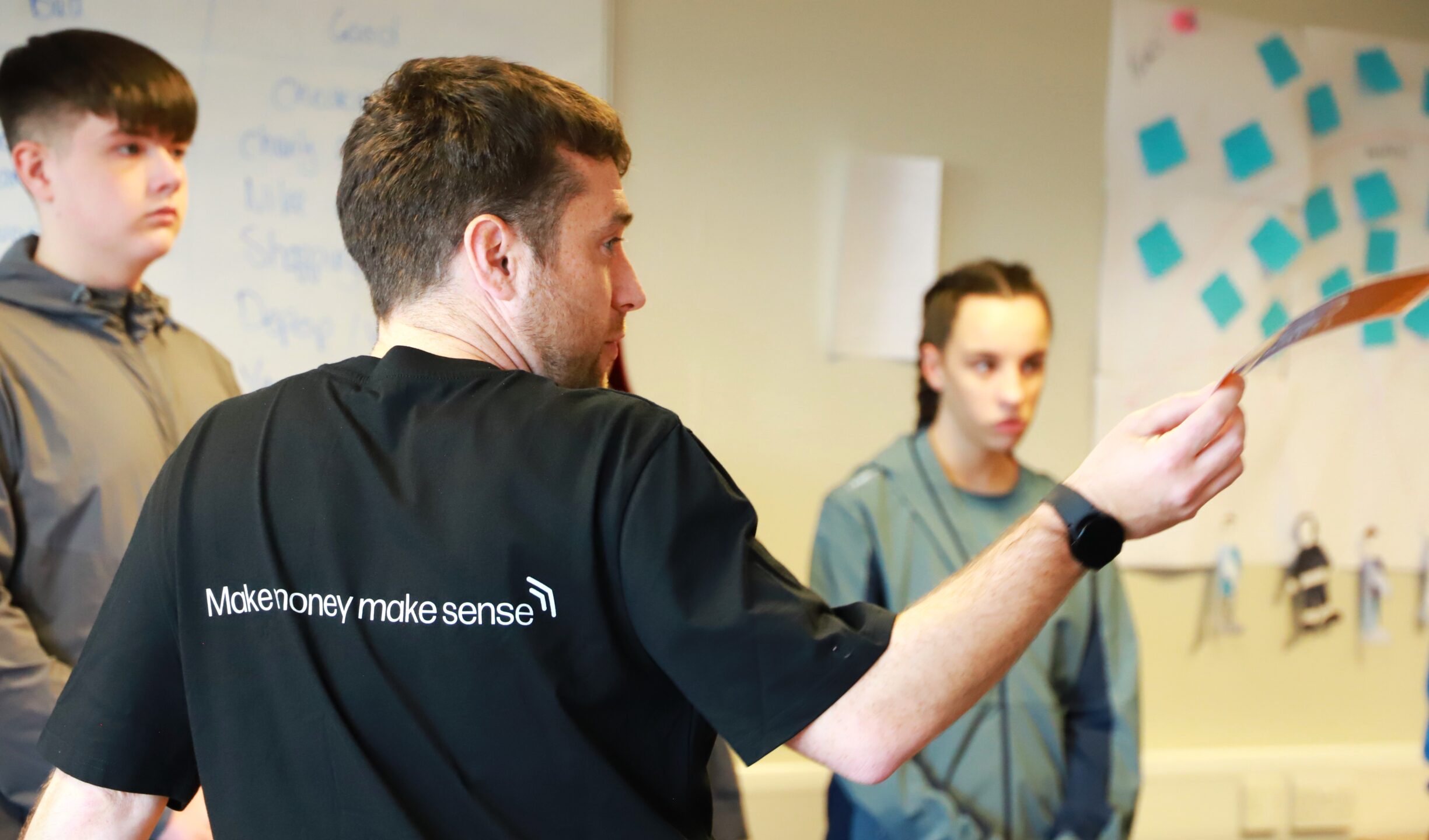
The Strapline – Make money make sense
Financial concepts are often complex and full of jargon. Our new strapline captures our belief that financial education should be clear, practical, and engaging. We make money make sense.
The Logo – Designed with meaning
Our new logo combines two familiar financial symbols:
- The 50p coin, representing everyday money
- The contactless signal, capturing the speed and evolution of modern finance
Together, they form a distinctive mark that conveys clarity, momentum, and trust, all core to the experience of becoming money ready.
The Colours – Inspired by real-world money
Our new colour palette draws inspiration from UK banknotes. It’s confident, flexible, and grounded in the everyday experience of handling money. These colours allow us to communicate with energy and credibility across all platforms.
You’ll also notice a subtle continuity from our MyBnk days — our new maroon and blue nod to the original red and blue, now evolved to feel more mature and adaptable.
The Path – A symbol of financial journeys
No two people take the same path when it comes to learning about money. That’s why one of the most important features of our new identity is the “path” – a flexible visual element that represents individual progress toward financial confidence.
Whether someone is just starting out or looking to rebuild, the path is a reminder that learning is a process, and that Money Ready is here to support people at every stage.
A message from Leon Ward, Money Ready CEO
“This rebrand emphasises the charity’s dedication to empowering people to understand and manage their money. It builds on our shift in focus from ‘age’ to ‘stage’, with programmes teaching financial education to people of all ages as Money Ready works to support the UK population to become financially fluent.”
What’s next?
This rebrand marks a new chapter, but our programmes, resources, and expert-led delivery remain unchanged in quality and impact. What’s changed is how we present ourselves to the world.
We’re launching a week of content across social media to spotlight different parts of our new brand, from the visual elements to the thinking behind the name and strapline. We invite you to explore the new site, watch our new video and get involved in spreading the word online.
Thank you
A sincere thank you to House 337 and Fat Beehive for their creativity, insight, and collaboration throughout this rebranding journey. And to everyone else who made this new chapter possible.
A final word
At Money Ready, we believe that everyone deserves the opportunity to understand and manage their money with confidence. This new identity allows us to better reflect that vision of creating a financially fluent population.
We’re proud of where we’ve come from, and even more excited about where we’re going.
Welcome to Money Ready.
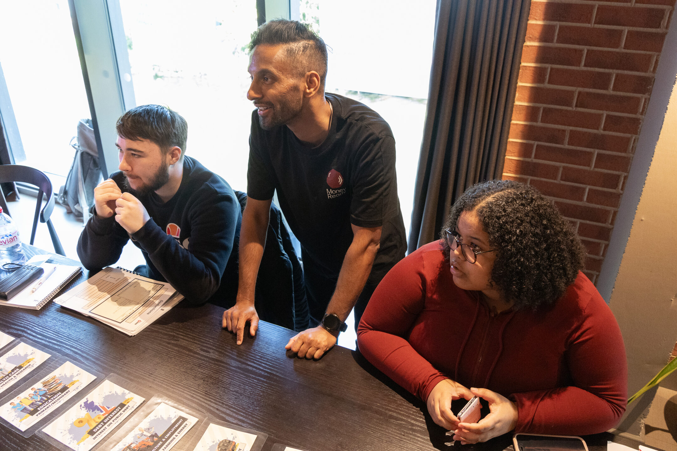
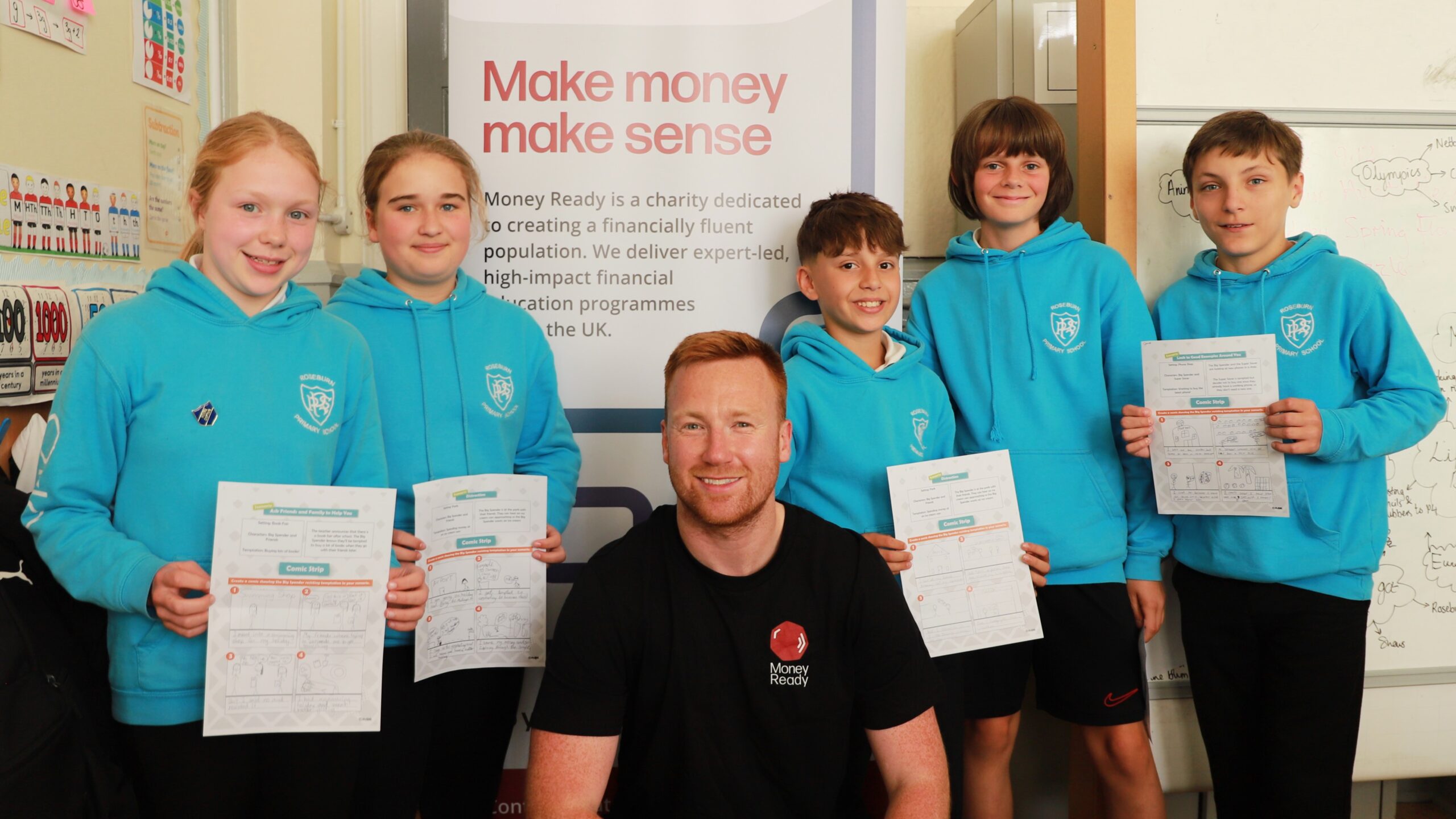
Money Ready in action